You may have heard of the terms Adaptive Web Design and Responsive Web Design as methods to ensure your website can be viewed across different devices.. This is certainly not a new subject, however given the rapidly changing pace of the web it's taken on a new approach on the best way to deal with it. While the two are often used interchangeably; there is a significant difference between each approach and the outcome it achieves.
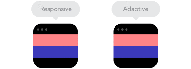
So what is Adaptive and Responsive design? A simple definition is that Responsive Design doesn’t care about what browser is used, it only responds to browser size. Essentially - it is the same content reformatted to suit different "viewports". Adaptive Design presents different content depending on the device you are using - allowing for a different experience across different devices.
We have developed Responsive sites for clients including
- Industry Property Group. Click to see
- VISY. Click to see
- Lebent. Click to see
So then, when do you use what?
Generally, when you're designing an adaptive site, you design for 6 common screen widths: 320, 480, 760, 960, 1200 and 1600 which are static sizes the screen detects and loads the site for. Adaptive is useful for retrofitting a site to make it mobile friendly. At first, adaptive may seem like more work but It gives you more control over content and layout that isn’t always available in responsive design. However, if a responsive site isn’t properly implemented, if can suffer on site speed.
A lot of new sites these days are responsive thanks to the likes of WordPress and other CMS systems. Responsive doesn’t offer the same control, but it takes less work to build. However when you design a responsive site you design with all layouts in mind and this can make the process more complex. That's not to say though that this is a bad thing. Responsive Design challenges us to create sites that are device-indifferent. They are optimised for any screen
There's no one way of saying that one is better than the other. It’s a matter of choosing the right tool for the project. Another way of deciding can be to look at your analytics. Where is your traffic coming from and how can you best suit them?
At DCODE, we are experienced in helping you to assess what sort of design you need and implementing it in the most effective way. We have worked with a range of clients in both areas leading to great success for them and their business objectives. Let's talk further about how we can help you to develop a well designed site to acheive greater success in your business.
--
Get updates, tips and industry news delivered directly to you